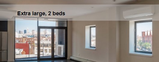
And that’s the size of a notch that has been carved into a 25-story apartment tower under construction in Long Island City, Queens, directly behind a waterfront billboard that PepsiCo has owned and maintained since 1936 and that is one of the most familiar features along the East River. The lower eight floors of the building have been recessed 12 feet, keeping them 45 feet distant from the back of the sign.
Building designs are influenced by zoning, financing, engineering and marketing. The 4610 Center Boulevard tower may be the first to be influenced by a swirls-and-curls, Depression-era, ruby-red, neon soft-drink sign.
“It is almost as if the face of the sign shaped the volumetrics of the building,” said Bernardo Fort-Brescia, a partner in the firm Arquitectonica, which designed 4610 Center Boulevard for TF Cornerstone, a development company run by the brothers K. Thomas and Frederick Elghanayan.
Once regarded as an eyesore, the sign is generally embraced today as a symbol of Long Island City’s industrial past, as a colossal work of Pop Art and as a way for those who live in the six buildings of TF Cornerstone’s Long Island City development to orient friends and families. (The back is not illuminated, so tenants are spared the film noir effect.)
It seems that if you keep a billboard long enough, it may turn into a civic cynosure. The Citgo sign at Kenmore Square, for instance, probably ranks ahead of the Old State House as a symbol of Boston. And the Pepsi sign was once considered for landmark status.
But the preservation of the sign involved more than an accommodating developer, an imaginative architect and a growing appreciation of popular history.
It reflects PepsiCo’s canny understanding, when it closed its Long Island City plant in 1999, that it owned an enviable bit of real estate. The Pepsi billboard occupies a site with no competing signs nearby. It is visible from two wealthy and well-traveled areas, the Upper East Side and the United Nations. And on the river’s edge, it will not be blocked by future towers.
The 147-foot-long sign was originally atop a factory building. Its letterforms, almost Gothic in their complexity, give the sign much of its appeal. This is a logo that originated in the late 19th century, and looks it. The “C” has a pennant and a big loop that trails back to join the bottom of the “P,” whose top resembles a horseshoe flying over a stake.
The letters are supported on an open armature, which emphasizes the sign’s mechanical quality. The bottle, sporting a slightly more up-to-date logo, was painted fairly crudely since it was meant to be seen at a distance. That adds to the charm.
In 2001, the Elghanayans, then partners in the Rockrose Development Corporation, were designated developers of the north end of the Queens West waterfront complex.
They were able to buy 21 acres from PepsiCo — except for a 60-by-200-foot parcel that PepsiCo carved out to serve as a permanent home for its billboard, on almost exactly the spot it once occupied, though much closer to the ground. “Pepsi was not going to sell the land to anyone unless they kept the sign,” said Jon McMillan, the planning director at Rockrose, who now has the same job at TF Cornerstone.
The sign was relocated for several years to the south end and reassembled in its current position in Gantry Plaza State Park in 2009. By that time, it was clear that the 4610 Center Boulevard tower would have to be built much closer to the sign than originally anticipated, given the way in which TF Cornerstone had pushed, pulled and laid out the overall 3.2-million-square-foot development.
Technically, the tower could have come closer to the sign. But Mr. Fort-Brescia, whose affection for the sign is evident, said that would have made it harder to read the billboard from across the river. Instead, he said, the cantilevered portion “creates a shadow box, so the letters stand out.”
“I didn’t want the sharp corners of a rectangle competing with the letters,” Mr. Fort-Brescia continued. “I chose to curve the corners so the building seems to fade away.” That the curves are also evocative of the streamlined Art Deco period in which the sign was erected is an added benefit, he said. But the design is not meant as historical allusion.
“This is all my impulse,” Mr. Fort-Brescia said, when asked if PepsiCo had requested or demanded such aesthetic deference. Besides, the sign will probably serve the developers’ interests equally well, since it confers special bragging rights on tenants.
“They’ll want to say, ‘I live behind the Pepsi sign,’” predicted Pablo Fernandez, TF Cornerstone’s no-nonsense job site superintendent. “People are funny that way.”